


World Energy And Population: Trends To 2100
By Paul Chefurka
20 November, 2009
Paulchefurka.ca
This article was written in October 2007. In a way, prophetical of the financial meltdown,that took the mainstream economists by surprise
Abstract
Throughout history, the expansion of human population has been supported by a steady growth in our use of high-quality exosomatic energy. The operation of our present industrial civilization is wholly dependent on access to a very large amount of energy of various types. If the availability of this energy were to decline significantly it could have serious repercussions for civilization and the human population it supports. This paper constructs production models for the various energy sources we use and projects their likely supply evolution out to the year 2100. The full energy picture that emerges is then translated into a population model based on an estimate of changing average per-capita energy consumption over the century. Finally, the impact of ecological damage is added to the model to arrive at a final population estimate.
This model, known as the "World Energy and Population" model, or WEAP, suggests that the world's population will decline significantly over the course of the century.
Introduction
During the historically recent period of global industrialization, the level of human population has been closely related to the amount of energy we have used. Over the last forty years, the per capita energy consumption has averaged about 1.5 tonnes of oil equivalent (toe) per person per year. As industrialization has progressed, the amount of per capita energy used has also increased, rising from a global average of 1.2 toe per person in 1966 to 1.7 toe per person in 2006. As the global energy supply tripled over that time, the population has doubled.
Figure 1 shows the close relationship between global energy consumption, world GDP and global population and implies that an overall increase in the energy supply has supported the increase in population. Can we assume that there would be negative consequences for the human population if our energy supplies should start to diminish? In this paper I shall present my estimate of the world energy situation over the next century, and tie that to a projection of the human population from now to 2100.

Figure 1: World Energy, GDP and Population, 1965 to 2003
Methodology
The analysis in this paper is supported by a model of trends in energy production. The model is based on historical data of actual energy production, connected to projections that are drawn from the thinking of various expert energy analysts as well as my own interpretation of future directions.
The current global energy mix consists of oil (36%), natural gas (24%), coal (28%), nuclear (6%), hydro (6%) and renewable energy such as wind and solar (about 1%). Historical production in each category (except for renewable energy) has been taken from the BP Statistical Review of World Energy 2007. In order to permit comparison between categories I use a standard measure called the tonne of oil equivalent (toe). Using this measure, well-known conversion factors permit the energy obtained from different sources to be easily compared. While this approach doesn't take into account the varying efficiencies of different sources like oil and hydroelectricity, it does provide a well accepted standard for general comparison.
We will first examine each of the energy categories separately, applying the development parameters that seem most appropriate to each. For each component I will define as clearly as possible the factors and parameters I have considered in building its scenario. This will allow you to decide for yourself whether my assumptions seem plausible. We will then combine them into a single global energy projection.
Once the energy picture has been established we will explore the effect the projected changes in energy supply may have on the world population. Once that baseline has been developed, we will incorporate the probable effects of ongoing ecological damage to arrive at a final projection of human numbers over the next century.
Notes
The WEAP model was developed as a simple Excel spreadsheet. The timing of significant energy-related events and rates of increase or decrease of supply were chosen through careful study of the available literature. In some cases different authors had diverging opinions on these matters. To resolve those situations I have relied on my own analysis and judgment. As a result the model has remained open to the influence of my personal biases. I make no apology for this; such scenarios always reflect the opinions of their authors, and it is best to be clear about that from the start. Nevertheless, I have made deliberate efforts throughout to be objective in my choices, to base my projections on observed trends in the present and recent past, and to refrain from wishful thinking at all times.
The WEAP model presents a global aggregation of the effects of energy and ecological factors on world population. Although there is some discussion of regional or national differences (which would be expected to have a profound impact on the course of events in those places), the model does not directly incorporate such influences. While you may see this lack of granularity as a shortcoming, the paper is intended to give a higher level view. Its purpose is to establish a broad conceptual framework within which such regional disparities may be understood.
This paper will not present any prescriptive measures. The analysis is intended solely to clarify a "most likely" future scenario, based purely on the situation as it now exists and will probably unfold. You will not find any specific suggestions for what we ought to do, or any proposals based on the assumption that we can radically alter the behaviour of people or institutions over the short term. While the probability of such changes will increase if the global situation shifts dramatically, such considerations would introduce a level of uncertainty into the analysis that would make it conceptually intractable. The same constraint holds true for new technologies. You will not find any discussion of fusion or hydrogen power, for example.
The Excel spreadsheet containing the data used to assemble the WEAP model is available here.
Energy Component Models
Oil
The analysis of our oil supply starts from the recognition that it is finite, non-renewable, and subject to effects which will result in a declining production rate in the near future. This situation is popularly known as Peak Oil. The key concept of Peak Oil is that after we have extracted about half the total amount of oil in place the rate of extraction will reach a peak and then begin an irreversible decline.
This happens both for individual oil fields and for larger regions like countries, but for different reasons. In individual oil fields this phenomenon is caused by geological factors inherent to the structure of the oil reservoir. At the national or global level it is caused by logistical factors. When we start producing oil from a region, we usually find and develop the biggest, most accessible oil fields first. As they go into decline and we try to replace the lost production, the available new fields tend to be smaller with lower production rates that don't compensate for the decline of the large fields they are replacing.
Oil fields follow a size distribution consisting of a very few large fields and a great many smaller ones. This distribution is illustrated by the fact that 60% of the world's oil supply is extracted from only 1% of the world's active oil fields. As one of these very large fields plays out it can require the development of hundreds of small fields to replace its production.
The theory behind Peak Oil is widely available on the Internet, and some introductory references are given here, here and here..
Timing
There is much debate over when we should expect global oil production to peak and what the subsequent rate of decline might be. While the rate of decline is still hotly contested, the timing of the peak has become less controversial. Recently a number of very well informed people have declared that the peak has arrived. This brave band includes such people as billionaire investor T. Boone Pickens, energy investment banker Matthew Simmons (author of the book "Twilight in the Desert" that deconstructs the state of the Saudi Arabian oil reserves), retired geologist Ken Deffeyes (a colleague of Peak Oil legend M. King Hubbert) and Dr. Samsam Bakhtiari (a former senior scientist with the National Iranian Oil Company).
My position is in agreement with the luminaries mentioned above, that the peak is happening as I write this (in late 2007). I have confirmed this to my own satisfaction by examining the pattern of oil production and oil prices over the last three years. I discovered in the process that crude oil production peaked in May 2005 and has shown no growth since then despite a doubling in price and a dramatic surge in exploration activity.
Decline Rate
The post-peak decline rate is another question. The best guides we have are the performances of oil fields and countries that are known to be already in decline. Unfortunately, those decline rates vary all over the map. The United States, for instance, has been in decline since 1971 and has lost two thirds of its capacity since then, for a decline rate of about 3% per year. On the other hand, the North Sea basin is showing an annual decline around 10%, and the giant Cantarell field in Mexico is losing production at rates approaching 20% per year.
In order to create a realistic decline model for the world's oil, I have chosen to follow the approach of Dr. Bakhtiari in his WOCAP model. He assumes a gradually increasing decline rate over time, starting off very gently and ramping up as the years go by. WOCAP has proven to be fairly accurate so far, and I have adopted a variant of it. The main difference is that my model is a little less aggressive. Where WOCAP predicts that production will fall from 4000 million tonnes of oil per year (Mtoe/yr) now to 2750 Mtoe/yr in 2020, my model doesn't reach that point until 2030. The WEAP model increases from a decline rate of 1% per year in 2015 to a constant rate of 5% per year after 2040. Even such a relatively conservative decline model gives astonishing results over the course of the century, as shown in Figure 2.
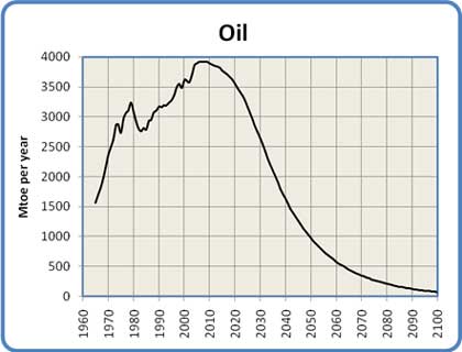
Figure 2: Global Oil Production, 1965 to 2100
The Net Export Problem
Before we leave the subject of oil, some comments about oil exports are in order. The graph in Figure 2 shows the aggregate oil production for the world. However, the world is not a uniform place of oil production and consumption. Some countries are net exporters of oil, while some are net importers who buy the exporters' oil on the international market.
In most countries the demand for oil is constantly increasing. This applies especially to oil exporting nations, where rising oil prices have stimulated economic growth. This additional growth has in turn resulted in a higher domestic demand for oil which is satisfied out of their surplus before it is made available for export. While the nation's oil production is increasing this does not pose much of a problem. When the exporting nation's production peaks and begins to decline however, something ominous happens: the amount of oil available for export declines at a faster rate than the production decline. This has become known as the "net oil export problem".
Consider this example. Say an exporting country produces one million barrels per day, and its citizens consume 500,000 barrels per day. This leaves 500,000 barrels for export. Then production declines by 5% per year. After one year their production is 950,000 barrels per day. At the same time, their economy is booming, resulting in an increased demand of 5%. This leads to a consumption of 525,000 barrels per day. That leaves only 425,000 barrels for export, for a 15% decline in exports. A graph over a number of years demonstrates the consequences:
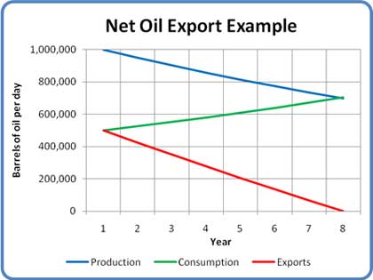
Figure 3: Net Export Example
At the end of 8 years, although the country is still producing over 700,000 barrels per day its exports have dropped to zero. This pattern has already been seen in Indonesia, the UK and the USA, each of whom was once a major oil exporter but is now a net importer.
This effect is already visible on the world oil market. Figure 4 shows a graph of total world exports over the last 5 years. An overlaid trend line (a second order polynomial for those who are interested) shows the pattern: an imminent, rapid drop in the world's net oil exports.
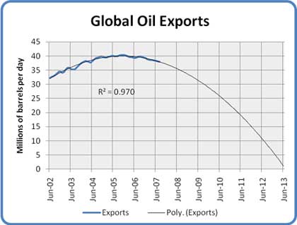
Figure 4: World Net Oil Exports 2002 to 2013
Such changes in exports are very worrisome for importing nations. The USA, for instance, imports about two thirds of its oil requirements. If the oil export market should suddenly begin to dry up as Figure 4 suggests it could, the US would be forced to make some very hard choices. These could include accepting a drastic reduction in industrial activity, GDP and lifestyle, abandoning the international oil market and enter into long-term supply contracts with producing nations, or even military action to secure foreign oil supplies (as may have already been attempted in Iraq).
I am indebted to the work of Jeffrey Brown and his Export Land Model for these insights.
Natural Gas
The supply situation with natural gas is very similar to that of oil. This makes sense because oil and gas come from the same biological source and tend to be found in similar geological formations. Gas and oil wells are drilled using very similar equipment. The differences between them have everything to do with the fact that oil is a viscous liquid while natural gas is, well, a gas.
While oil and gas will both exhibit a production peak, the slope of the post-peak decline for gas will be significantly steeper due to its lower viscosity. To help understand why, imagine two identical balloons, one filled with water and the other with air. If you set them down and let go of their necks, the air-filled balloon will empty much faster than the one filled with water. A gas reservoir works much the same way. When it is pierced by the well, the gas flows out under its own pressure. As the reservoir empties the flow can be kept relatively constant until the gas is gone, then it will suddenly stop.
Gas reservoirs show the same size distribution as oil reservoirs. As with oil, we found and drilled the big ones first. The reservoirs that are coming on-line now are getting progressively smaller, requiring a larger number of wells to be drilled to recover the same volume of gas. For example, the number of gas wells drilled in Canada between 1998 and 2004 went up by 400% (from 4,000 wells in 1998 to 16,000 wells in 2004), while the annual production stayed constant. All this means that the natural gas supply will exhibit a similar bell-shaped curve to what we saw for oil.
One other difference between oil and gas is the nature of their global export markets. Compared to oil, the gas market is quite small. This is due to the difficulty in transporting a gas as opposed to a liquid. While oil can be simply pumped into tankers and back out again, natural gas must first be liquefied (which takes substantial energy), transported in special tankers at low temperature and high pressure, then re-gasified at the destination which requires yet more energy. As a result most of the world's natural gas is shipped by pipeline. This pretty well limits gas to national and continental markets. That has an important implication: if a continent's gas supply runs low it is very difficult to supplement it with gas from somewhere else that is still well-supplied.
The peak of world gas production may not occur until 2025, but two things are sure: we will have even less warning than we had for Peak Oil, and the subsequent decline rates may be shockingly high. For the gas model I have chosen as the peak a plateau from 2025 to 2030. This is followed by a rapid increase in decline to 8% per year by 2050, remaining at a constant 8% per year for the following 50 years. This gives the production curve shown in Figure 5.
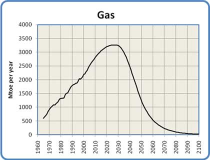
Figure 5: Global Natural Gas Production, 1965 to 2100
Coal
Coal is the ugly stepsister of fossil fuels. It has a terrible environmental reputation, going back to its first widespread use in Britain in the 1700s. London's coal-fired "peasoup" fogs were notorious, and damaged the health of hundreds of thousands of people. Nowadays the concern is less about soot and ash than about the carbon dioxide that results from burning coal. Weight for weight, coal produces more CO2 than either oil or gas. From an energy production standpoint coal has the advantage of very great abundance. Of course this abundance is a huge negative when considered from the perspective of global warming.
Most coal today is used to generate electricity. As economies grow, so does their demand for electricity, and if electricity is used to replace some of the energy lost due to the decline of oil and natural gas, this will put yet more upward pressure on the demand for coal. At the moment China is installing two to three new coal-fired power plants per week, and has plans to continue at this pace for at least the next decade.
Just as we saw with oil and gas, coal will exhibit an energy peak and decline. One factor in this is that we have in the past concentrated on finding and using the highest grade of coal, anthracite. Much of what remains consists of lower grade bituminous and lignite. These grades of coal produce less energy when burned, and require the mining of ever more coal to get the same amount of energy.
The Energy Watch Group has conducted an extensive analysis of coal use over the next century, and I have adopted their "best case" conclusions as a starting point for this model. The model projects a continued rise in the use of coal out to a peak in 2025. As global warming begins to have serious effects there will be mounting pressure to reduce coal use, resulting in a slightly more aggressive decline slope than the one projected by the Energy Watch Group. Unfortunately, due to its abundance and our need to replace some of the energy lost from the depletion of oil and gas, the decline in coal use will not be as dramatic as seen with those fossil fuels. The model has the annual decline in coal use increasing evenly from 0% in 2025 to a steady 5% annual decline in 2100. These assumptions give the curve shown in Figure 6.

Figure 6: Global Coal Production, 1965 to 2100
Of course this use of coal carries with it the threat of increased global warming due to the continued production of CO2. Many hopeful words have been written about the possibility of alleviating this worry by implementing Carbon Capture and Storage. CCS usually involves the capture and compression of CO2 from power plant exhaust, which is then pumped into played-out gas fields for long term storage. This technology is still in the experimental stage, and there is much skepticism surrounding the security of storing such enormous quantities of CO2 in porous rock strata. Such plans play little part in this analysis, although later when we discuss the intersection of ecological degradation with declining energy I will assume that little has been done compared to the scale of global CO2 generation.
Nuclear
The graph in Figure 7 is the result of a data synthesis and a bit of projection. I started with a table of reactor ages from the IAEA (reprinted in a presentation to the Association for the Study of Peak Oil and Gas), the table of historical nuclear power production numbers from the BP Statistical Review of World Energy 200 and a table from the Uranium Information Centre showing the number of reactors that are installed, under construction, planned or proposed worldwide.
The interesting thing about the table of reactor ages is that it shows that the vast majority of them (361 out of 439 or 82% to be precise) are between 17 and 40 years old. The number of reactors at each age varies of course, but the average number of reactors in each year is about 17. The number actually goes over 30 in a couple of years.
Two realizations form the basis for my model of nuclear power. The first is that since reactors have a finite lifespan averaging around 40 years, a lot of the world's reactors are rapidly approaching the end of their useful life. The second is that the replacement rate inferred from the UIC planning table is only about three to four reactors per year for at least the next ten years, and probably the next twenty.
These two facts mean that within the next twenty years we will have retired over 300 reactors, but will have built only 60. So by 2030 we will have seen a net loss of 240 or more reactors: over half the present stock. Since these reactors are all broadly similar in size (a bit less than 1 GW on average) that means we can calculate the approximate world generating capacity at any moment in time, with reasonable accuracy out to 2030 or so.
The model takes a generous interpretation of the available data. It assumes we will build 3 GW of nuclear capacity per year for the next ten years (about what is under construction now), 4.5 GW per year for the subsequent ten years (these are the reactors in the planning stages that will probably end up being built), and 6 GW/year for the 20 years following that from the reactors that have been proposed. It assumes a rising construction profile because I think we will start to get desperate for power in about 20 years - this is the reason reactor completions double over that period compared to today.
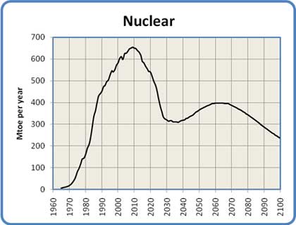
Figure 7: Global Nuclear Production, 1965 to 2100
The drop in capacity between now and 2030 is the result of new construction not keeping pace with the rapid decommissioning of large numbers of old reactors. The rise after 2030 comes from my prediction that we will double the pace of reactor construction in about 2025 when the energy situation starts to become visibly desperate and we realize that most of the reactors from the 1970-1990 building boom are out of service. The final decline after 2060 comes from my expectation that we will start losing global industrial capacity in a big way in a few decades due to the decline in oil and natural gas. As a result, by 2060 we won't have the capability we would need to replace all our aging nuclear reactors.
The argument for a peak in nuclear capacity in 2010 and the subsequent drop is very similar to the logistical considerations behind Peak Oil - the big pool of reactors is about to be exhausted, and we're not building enough replacements. In fact, to stay even with the rate of decommissioning of our current reactor base we would need to build 17 new reactors a year (more than 5 times the number that are now on the books) forever. That seems very unlikely given the capital, regulatory and public relations environments that the nuclear industry is now operating in.
As an aside, the drop in generating capacity after 2010 means that any concerns about outstripping the supply of mined uranium (currently about 50,000 tonnes per year worldwide) are avoided altogether.
Hydro
If coal is the ugly stepsister, hydro is one of the fairy godmothers of the energy story. Environmentally speaking it's relatively clean, if perhaps not quite as clean as once thought. It has the ability to supply large amounts of electricity quite consistently. The technology is well understood, universally available and not too technically demanding (at least compared to nuclear power). Dams and generators last a long time.
It has its share of problems, though they tend to be quite localized. Destruction of habitat due to flooding, the release of CO2 and methane from flooded vegetation, and the disruption of river flows are the primary issues. In terms of further development the main obstacle is that in many places the best hydro sites are already being used.
Nevertheless, it is an attractive energy source. Development will probably continue in the future at a similar pace as in the past, at least until loss of technological capacity or demand makes further development moot.
In order to project the growth rate of hydro power, I used a second order polynomial curve fitted to the production history of the past 40 years. Using such a projection assumes that future development will look very much like the past, at least until an external influence alters the course of events. The projection is shown in Figure 8. One thing that gives confidence in the reliability of the projection is the high correlation of the chosen curve to the actual data, as shown in the R-squared value of .994 (the closer to 1.0 the better the fit).
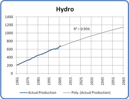
Figure 8: Projected Hydro Production
The model for hydro power shown in Figure 9 has capacity growing to about double its current level by 2060. It then declines back to the current level by 2100. The peak and subsequent decline in the second half of the century is attributed to the full occupancy of virtually all high-value hydro sites, a general loss of global industrial capacity and a reduction in water flows due to global warming. These are the external influences mentioned above.
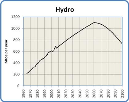
Figure 9: Global Hydro Production, 1965 to 2100
Renewable Energy
Renewable energy includes such sources as wind, photovoltaic and thermal solar, tidal and wave power etc. Assessing their probable contribution to the future energy mix is one of the more difficult balancing acts encountered in the construction of this model. The whole renewable energy industry is still in its infancy. At the moment, therefore, it shows little impact but enormous promise. While the global contribution is still minor (at the moment renewable technologies supply less than 1% of the world's total energy needs) its growth rate is exceptional. Wind power, for example, has experienced annual growth rates of 30% over the last decade.
Proponents of renewable energy point to the enormous amount of research being conducted and to the vast range of approaches being explored. They also point out correctly that the incentive is enormous: the development of renewable alternatives is crucial for the sustainability of human civilization. All this awareness, work, and promise give the nascent industry an aura of strength verging on invincibility. That in turn supports a conviction among its promoters that all things are possible.
Of course, the real world is full of unexpected constraints and unwarranted optimism. One such constraint has shown up in the field of biofuels, where a realization of the conflict between food and fuel has recently broken through into public consciousness. One can also see excessive optimism at work in the same field, where dreams of replacing the world's gasoline with ethanol and biodiesel are now struggling against the limits of low net energy in biological processes.
The key questions in developing a believable model are, what is the probable long-term growth rate of renewable energy going to be over the next 50 years, and what amount of energy will it ultimately contribute?
While I do not subscribe to the pessimistic notion that renewables will make little significant contribution, it's equally unrealistic to expect that they will achieve a dominant position in the energy marketplace. This is primarily because of their late start relative to the imminent decline of oil, gas and nuclear power, as well as their continued economic disadvantage relative to coal.
In order to project a realistic growth rate for renewable energy I have used the same approach as with hydro above. Data on the global production of renewable energy from 1980 to 2005, collected by the Energy Information Agency , was used as the starting point for the projection shown in Figure 10. As in the earlier use of this technique for the projection of hydro production, the closeness of the fit (again a second order polynomial giving an R-squared value of .994) gives a high degree of confidence in the projection.
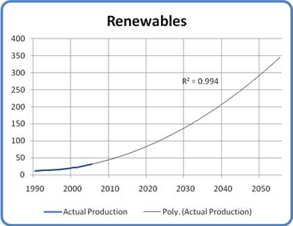
Figure 10: Projected Renewable Production
This technique has a couple of shortcomings. First, it aggregates all renewable energy sources: geothermal, solar, wind, biomass etc. Because some of these sources are still in their infancy, it is possible that they may exhibit higher growth rates in the future, thus making the projection too conservative. Balancing this of course is the possibility that they may run into unexpected constraints, skewing the outcome in the other direction. The second problem is that due to the youth of the industry large discontinuities in production from year to year may render the curve fit unreliable. These objections have been addressed by using only the most recent 15 years of data as the basis for the projection. This encompasses the years of highest growth in the wind and solar industries, and as we see from the high correlation of the fit, the yearly variation from the curve is quite low. On balance, the projection seems suitable as a basis for the model.
I have placed the peak contribution in 2070. Production declines following the peak because many renewable energy sources (e.g. wind turbines and photovoltaic solar panels) are dependent on a high level of technology and manufacturing capacity. Still, the model foresees renewables contributing more to the energy picture at the end of the century than any other source except for hydro.
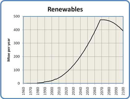
Figure 11: Global Renewable Energy Production, 1965 to 2100
Putting the Energy Sources in Perspective
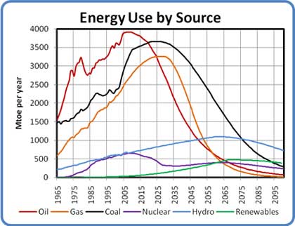
Figure 12: Energy Use by Source, 1965 to 2100
Figure 12 shows all the above curves on a single graph. This gives a sense of the relative timing of the various production peaks, as well as showing the contribution of each energy source relative to the others over time.
As you can see, fossil fuels are by far the most important contributors to the world's current energy mix, but all three are in rapid decline by the second half of the century. Hydro and renewables are making respectable contributions by mid-century, while nuclear power plays a constant role. By the end of the century, oil and natural gas have dropped out of the picture almost entirely, while the dominant players are hydro, renewable sources , coal and nuclear power, in that order.
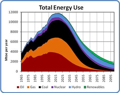
Figure 13: Total Energy Use, 1965 to 2100
Figure 13 has all the energy curves added together to show the overall shape of total world energy consumption. This graph aggregates all the rises, peaks and declines to give a sense of the complete energy picture out to 2100. The graph shows a strong peak in about 2020, with a steepening decline out to 2100. The main reason for the decline is the loss of oil, gas, and (to a lesser extent) coal. The decline is cushioned by an increase in hydro and renewables over the middle of the century, and averages out to a little less than 3% per year.
Unfortunately, the loss of the enormous contribution of fossil fuels means that the total amount of energy available to humanity by the end of the century may be less than one fifth of the amount we use now, and less than one sixth the amount we will use at our energy peak a decade or so from now. This shortfall contains an ominous message for our future. That message is the subject of the remainder of this paper.
The Effect of Energy Decline on Population
As I said in the introduction, human population growth has been enabled by the growth in our energy supply. It is now time to examine this relationship a little more closely, and to think about the implications of the global energy model we have just assembled.
The Historical and Current Situation
According to an analysis of historical human energy use published by Western Oregon University, while per our capita food energy consumption has remained relatively constant (within a range of 3:1 over most of human history), the energy we each use for the rest of our activities has grown almost thirty times from our early agricultural days to the consumption we now see in developed countries. The world's population has increased by a similar amount in that time, from 200 million in 1 CE to 6.6 billion today.
One of the more significant results from the WOU study is the non-food energy consumption of an "advanced agricultural man" from northern Europe in the 1400s. When that number of 20,000 kilo-calories per day is converted to our standard measure of tonnes of oil equivalent, it turns out to be 0.75 toe per year. The consumption of an "early industrial man" in 1875 was estimated to be 2.5 toe per year. For comparison, the global average per capita non-food energy consumption in 1965 was only 1.2 toe per year.
There is of course a great disparity in global energy consumption. The combined populations of China, India, Pakistan and Bangladesh (2.7 billion) today use an average of just 0.8 toe per person per year, compared to the global average of 1.7 and the American consumption of about 8.0.
It is reasonable to expect that a declining world energy supply would affect countries at opposite ends of the consumption spectrum quite differently. The picture will be further complicated by the effects of declining net oil exports on oil importing nations, and whether those nations are rich or poor. While a rigorous analysis of these effects is beyond the scope of this paper, we will look at some of the probable short and medium term impacts. This will be in addition to our examination of the overall effect of energy decline on global population that is the main objective of the paper.
Long-Term and Aggregate Effects
As shown in the example of the "agricultural man" above, human beings need a significant amount of energy to sustain even a relatively poor quality of life. This implies that as energy supplies decline and per capita energy falls, the quality of life of those on the bottom end of the consumption scale will be drastically affected. The degree of the effect will depend on how close they are to a bare subsistence level of consumption.
In our civilization, scarce goods are allocated by price: the scarcer a necessary good is, the higher its price will go. Those who can afford to pay can acquire it at the expense of those who cannot. Those who are out-bid have to reduce their consumption or even do without. This applies as much to energy as an aggregate commodity as it does to any other good.
The extent to which someone can survive a drop in energy supplies and the resulting rise in energy prices depends primarily on whether they have other consumption they can forego to allow them to pay for the energy they need. Those at the bottom of the economic ladder have no ability to reallocate their discretionary spending for this purpose, because they have no discretionary spending. As a result, they will be out-bid and will have to do without some amount of fuel or electricity. If their consumption is already so low that it barely sustains them, such an occurrence would obviously be catastrophic.
Over 4.5 billion of the world's 6.6 billion occupants live in countries that have per capita energy consumptions under 2.0 toe per year. As energy supplies decline, these countries are at risk of vast increases in mortality as they are out-bid in the global energy marketplace and their populations begin to fall below the minimum energy level required for sustaining life.
Short Term and Regional Effects
These effects will result primarily from Peak Oil and the coming net export crisis. As the effects of declining exports are felt, the market price of oil will escalate very rapidly.
Some oil producing countries will choose to sell much of their product on the international market for the money it will bring. Such actions may result in a deprived and discontented population, giving rise to fuel riots and even the threat of revolution. Other producers may decide to keep their oil at home to preferentially supply their own citizens' needs. This will result in a wave of nationalization of oil resources so that governments can direct its distribution and control the local price.
Oil importing nations will face a choice similar to the poor nations described in the previous section. They will need to reallocate their discretionary money toward the purchase of oil. If that cannot buy enough to satisfy their needs they will be forced to reduce their consumption. If they are unwilling to do either, and have the means available, they may decide to secure their oil supply by force of arms. Nearby producing nations that are keeping (or thought to be keeping) their oil off the world market will be at special risk of becoming targets in a resource war. Some aspects of this geopolitical energy calculus may have already come into play in the American invasion of Iraq.
The net oil export crisis may well be the defining geopolitical event of the next decade.
The Population Model
The population model is based mainly on the long-term aggregate effects of energy decline. The mechanisms of the population decline it projects are not specified. However, it is likely that they will include such things as major regional food shortages, a spread of diseases due to a loss of urban medical and sanitation services and an increase in deaths due to exposure to heat and cold.
The main interaction in the model is between the energy available at any point in time (shown in Figure 13) and an estimate of average global per capita consumption. Current global consumption is about 1.7 toe per person per year, and in the model that declines evenly to a consumption of 1.0 toe per person per year by 2100. To put that in perspective, the world average in 1965 was 1.2, so the model is not predicting a huge decline below that level of consumption. An increase in the disparity between rich and poor nations is also likely, but that effect is masked by this approach.
Under those assumptions, the world population would rise to about 7.5 billion in 2025 before starting an inexorable decline to 1.8 billion by 2100.
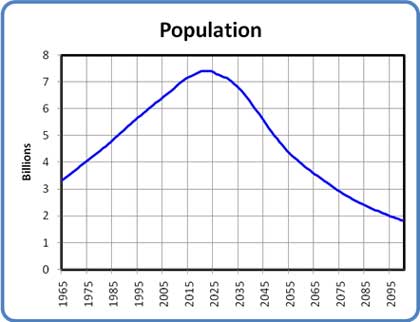
Figure 14: World Population with Declining Energy, 1965 to 2100
Effects of Ecological Damage
In order to complete the picture of human population over the next century it is necessary to bring some ecological insights to bear.
According to Wikipedia:
Ecology is the scientific study of the distribution and abundance of living organisms and how the distribution and abundance are affected by interactions between the organisms and their environment.
There are two ecological concepts that are the keys to understanding humanity's situation on our planet today. The first is Carrying Capacity, the second is Overshoot.
Carrying Capacity
The carrying capacity of an environment is established by the quantity of resources available to the population that inhabits it. The usual limiting resource is assumed to be the food supply. For plants and animals this definition is easily applied. The fluctuations in predator-prey relationships (e.g. wolves and deer or foxes and rabbits), or the number of buffalo that can live on a given area of prairie grassland are classic examples.
When we try to apply this definition to human beings we run into problems. In the animal world if a population is below the carrying capacity of its environment it will expand, and when it reaches the carrying capacity its numbers will stabilize. In the case of human beings, however, our numbers have been growing for a very long time, and in fact are still growing, though more slowly. Does this mean that we have not yet reached the carrying capacity of the Earth, or are other factors at work?
The missing consideration is, of course, the type of resource consumption by the individuals in the population.
In the animal world the main resource consumed is food, which is a fairly constant requirement. It may fluctuate somewhat due to such factors as growth or seasonal energy needs, but on average the amount of food that any organism needs to live is relatively stable. Since animals have few resource needs outside food and water it is relatively easy (at least conceptually) to establish the carrying capacity of a given environment for a particular species.
Even for humans, as we saw earlier, the amount of food we require to survive varies within only a small range – say 2000 to 5000 kilocalories per day, depending on our level of activity. What is variable, makes us distinct from other animals and makes the question of human carrying capacity more complicated is of course the level of non-food resources that humans consume. This can and does vary all over the map. In the previous sections we have been using energy as a proxy for all these resources.
My preferred definition of carrying capacity is:
The carrying capacity of a given environment is the maximum number of individuals that the environment can support sustainably at a given level of activity.
Sustainability is defined as follows:
A sustainable process or state is one that can be maintained at a certain level indefinitely. A sustainable process or state should provide optimal conditions for all organisms affected by it. A sustainable process or state must not threaten, directly or indirectly, the viability of any of the organisms affected by it.
Given these definitions it is intuitively obvious that the current level of human activity is not sustainable. The fact that it has been possible at all is mainly because of the use of fossil fuel, a non-renewable resource. That use is by definition unsustainable, and Peak Oil is graphic evidence of that fact.
Overshoot
A species is said to be in overshoot if its numbers (or more properly, its aggregate level of consumption) has exceeded the carrying capacity of its environment.
When a population rises beyond the carrying capacity of its environment, the existing population cannot be supported and must eventually decline to match or fall below the carrying capacity. A population usually cannot stay in overshoot for long. The rapidity and extent of the decline depend on the degree of overshoot and whether the carrying capacity is eroded during the overshoot, as shown in Figure 15. William Catton's book "Overshoot" is recommended for a full treatment of the subject.
There are two ways a population in overshoot can regain its balance with the carrying capacity of its environment. If the population stays constant or continues rising, its activity (expressed in terms of per capita resource consumption and waste production) must fall. If per capita consumption stays constant, population numbers must decline.
Populations in serious overshoot always decline. This is seen in wine vats when the yeast cells die after consuming all the sugar from the grapes and bathing themselves in their own poisonous alcoholic wastes. It's seen in predator-prey relations in the animal world, where the depletion of the prey species results in a reduction in the number of predators. This population reduction is known as a crash or a die-off, and can be very rapid.
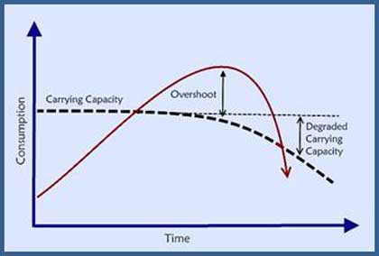
Figure 15: Overshoot
It is an axiom of ecology that overshoots degrade the carrying capacity of the environment. This is illustrated in the declining "Carrying Capacity" curve in Figure 15. In the case of humanity, our use of oil has allowed us to perform prodigious feats of resource extraction and waste production that would simply have been inconceivable without the one-time gift of oil. Fossil fuels in general and oil in particular have made it possible for humanity to stay in a state of overshoot for a long time.
At the same time, the use of fossil fuel and other high-intensity energy has allowed us to mask the underlying degradation of the Earth's carrying capacity. For instance, the loss of arable land and topsoil fertility (estimated at 30% or more since World War II) has been masked by the use of artificial fertilizers made largely from natural gas. Another example is the death of the oceans, where 90% of all large fish species are now at risk, and most fish species will be at risk within 40 years. This situation would be calamitous for nations that depend on the oceans for food, except that the use of fossil fuels allow them to fish ever farther from their home waters or import non-oceanic food to make up for the shortage of fish. Depleted water tables can be supplemented by water pumped from deeper wells; air pollution can be avoided by the use of air conditioners, etc. All of these indicate that ecological decline is being conveniently masked by our use of energy.
As our supply of energy (and especially that one-time gift of fossil fuels) begins to decline, this mask will be gradually peeled away to reveal the true extent of our ecological depredations. As we have to rely more and more on the unassisted bounty of nature, the consequences of our actions will begin to affect us all.
It is impossible to say with certainty how deep into overshoot humanity is at the moment. Some calculations point to an overshoot of 25%, others hint that it may be much greater than that. No matter what that number "really" is, there is no question of the damage we have done to the natural systems of air, land and water that supported us before the advent of coal, oil, and natural gas.
In order to complete the population model, I have factored in a gradually increasing effect from the unmasking of the world's loss of carrying capacity. The effect increases over time for two reasons. The first is simply that with less energy we won't be able to hide the existing ecological losses as well. The second is more insidious: as our energy supply declines we will do ever greater damage to the ecosphere in our attempt to forestall the inevitable. One major example of this is the increase in Global Warming that will come from the extra CO2 produced by the coal we will burn to try and replace the energy lost from declining oil and gas.
As in other aspects of this model, aggregation has been used to make the calculations more straightforward. In this case I have used a single numerical expression for "ecological damage" that rolls up all the possible sources of damage into a single mathematical term. The damage is assumed to come from a large variety of sources: climate change (e.g. droughts, flooding and other extreme weather events), loss of soil fertility, loss of fresh water supplies, the death of the oceans, chemical pollution of land and water, and the loss of biodiversity due to extinctions, habitat loss and monoculture food production. Such an aggregation necessarily results in a loss of precision, and may overstate or understate the actual situation. The chosen values represent my best estimate of the current state of the global ecology.
The model assumes that the impact of diminished carrying capacity will start now, and will reach about 40% by 2100. This 40% number represents the extent to which carrying capacity has been diminished and can no longer be masked by energy use. This impact is applied directly to the population numbers from Figure 14: an impact of 40% is taken to mean that the world will be able to support 40% fewer people than it might without the effect.
This affects the scenario in a three ways. First, the maximum population is slightly lower than it was in Figure 12. Second, the decline curve is a bit steeper. Most importantly the ultimate population in 2100 is no longer 1.8 billion, but just 1 billion people. Figure 15 shows the final population curve.

Figure 16: World Population with Declining Energy and Carrying Capacity, 1965 to 2100
Discussion
The scenario developed in this paper is fearsome indeed, and most people have an instinctive aversion to discussions of overpopulation or die-off. In my opinion, however, an awareness of the possibilities described here is essential if we are to make correct decisions on actions and policy at both the personal and government levels. An understanding of the problems of scale relating to energy sources is fundamental to this awareness.
The immediate objection to any worries about overpopulation is that population is declining naturally anyway, and will soon stabilize at a manageable number. The proper objective is therefore to hasten the fall of fertility rates, usually through the education and empowerment of women. Others claim that birth rates will fall naturally as poor nations industrialize, through the behaviour described by the Demographic Transition Model. We will examine each argument on its merits.
The education and empowerment approach has much to recommend it. It is humane, provides major benefits to societies where it occurs, and costs very little in either economic or energy terms. It is a valuable tool that must be promoted at every opportunity. Even in a resource-depleted world of one billion people, communities where such principles are in action will be much better off than those that hew strictly to the dominant "masculine" principles of our civilization (e.g. competition, domination and exploitation). Empowering women improves the diversity of values and makes more room for alternative social organizations, expanded conflict resolution approaches and a better understanding of humanity's relationship to our environment.
What we should not expect is that this approach will make a significant contribution to resolving the population problem in the time we have left. Education and empowerment take time, and there is far too little time remaining before the first wave of impacts is upon us. Where it will help is during the population decline. That decline will be going on for many years, possibly for two or three generations. During that time, any birth that is humanely avoided adds one less person to the pool of those who are at horrifying risk of war, disease, starvation and death. Under such circumstances I would expect birth rates to fall dramatically anyway, but if we concentrate on educating and empowering women we will make fertility reduction more likely, along with improving the lot of those whose task it will be to keep civilization running.
Proponents of the Demographic Transition Model have a more difficult time. That model proposes that as a society industrializes it goes through two phases, the first consisting of rising life expectancies, the second characterized by a drop in fertility. The society transitions from a demographic situation of high birth and death rates through one of high birth and low death rates, to one of low birth and death rates. I have published a study examining the energy that might be required to bring the world to a stable or declining population by this method. The result of that study was that it would take over five times the energy we use today to accomplish this, which is clearly an unrealistic expectation.
This leads naturally to the question, "Well, what if we come up with a new source that will give us the energy we need? What about fusion power or some even more exotic source? Wouldn't that take care of it?" My response is to suggest that the questioner take a hard look at what we've done with the energy we do have. Using it we have strip-mined the topsoil, drained the aquifers, destroyed the oceans, melted the glaciers, changed the very temperature of the planet, and exterminated untold other species in the process. Would more energy change that behaviour? There isn't a chance in (what's left of) the world.
In any event, if the conclusions of this model are anywhere close to correct all these arguments are moot. Energy constraints will trigger a reduction in population starting within 20 years, and the impact of those constraints will far exceed anything that such humanitarian measures could accomplish. In fact, if the model is correct, there will be no ongoing overpopulation problem at all, as natural processes intervene to bring our numbers back in line with our resource base.
This leaves the question of what such a population decline would look and feel like. The details of such a profound experience are impossible to predict, but it's safe to say it will be catastrophic far beyond anything humanity has experienced. The loss of life alone beggars belief. In the most serious part of the decline, during the two or three decades spanning the middle of this century, even with a net birth rate of zero we might expect death rates between 100 million and 150 million per year. To put this in perspective, World War II caused 10 million excess deaths per year, and lasted a scant 6 years. This could be 50 times worse. Of course, a raw statement of excess deaths doesn't speak to the risk this will pose to the fabric of civilization itself. If it is true that the Inuit have a dozen words for "snow", we will need to invent a hundred for "hard times".
Conclusion
All the research I have done for this paper has convinced me that the human race is now out of time. We are staring at hard limits on our activities and numbers, imposed by energy constraints and ecological damage. There is no time left to mitigate the situation, and no way to bargain or engineer our way out of it. It is what it is, and neither Mother Nature nor the Laws of Physics are open to negotiation.
We have come to this point so suddenly that most of us have not yet realized it. While it may take another twenty years for the full effects to sink in, the first impacts from oil depletion (the net oil export crisis) will be felt within five years. Given the size of our civilization and the extent to which we rely on energy in all its myriad forms, five years is far too short a time to accomplish any of the unraveling or re-engineering it would take to back away from the precipice. At this point we are committed to going over the edge into a major population reduction.
However, this does not mean that we should adopt a fatalistic stance and assume there is nothing to be done. In fact nothing could be further from the truth. The need for action is more urgent now than ever. Humanity is not going to go extinct. There are going to be massive and ever-growing numbers of people in dire need for the foreseeable future. We need to start now to put systems, structures and attitudes in place that will help them cope with the difficulties, find happiness where it exists and thrive as best they can. We need to develop new ways of seeing the world, new ways of seeing each other, new values and ethics. We need to do this with the aim of minimizing the misery and ensuring that as many healthy, happy people as possible emerge from this long trauma with the skills and knowledge needed to build the next cycle of civilization.
October, 2007
© Copyright 2007, Paul Chefurka
This article may be reproduced in whole or in part for the purpose of research, education or other fair use, provided the nature and character of the work is maintained and credit is given to the author by the inclusion in the reproduction of his name and/or an electronic link to the author's web site. The right of commercial reproduction is reserved.